Automobile data set - EDA & Visualizations
Automobile-EDA-Visualizations


Contents:
- Introduction
- Data Cleaning
- Missing Data
- Data Stories and Visualizations
DATA CLEANING
- Data types:
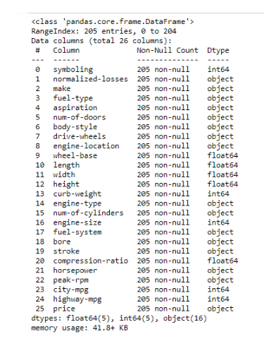
Data volume - 205 rows.
Data columns - 26 columns.
Data Types - float64 (5), int64 (5), object (16).
From the NULL check, no null values found.
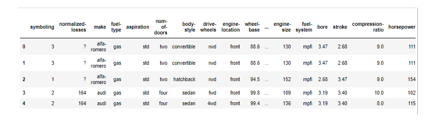
2. Data Snapshot (few rows):
3. Feature Attributes:
- symboling: -3, -2, -1, 0, 1, 2, 3.
- normalized-losses: continuous from 65 to 256.
- make: alfa-romero, audi, bmw, chevrolet, dodge, honda, isuzu, jaguar, mazda, mercedes-benz, mercury, mitsubishi, nissan, peugot, plymouth, porsche, renault, saab, subaru, toyota, volkswagen, volvo
- fuel-type: diesel, gas.
- aspiration: std, turbo.
- num-of-doors: four, two.
- body-style: hardtop, wagon, sedan, hatchback, convertible.
- drive-wheels: 4wd, fwd, rwd.
- engine-location: front, rear.
- wheel-base: continuous from 86.6 120.9.
- length: continuous from 141.1 to 208.1.
- width: continuous from 60.3 to 72.3.
- height: continuous from 47.8 to 59.8.
- curb-weight: continuous from 1488 to 4066.
- engine-type: dohc, dohcv, l, ohc, ohcf, ohcv, rotor.
- num-of-cylinders: eight, five, four, six, three, twelve, two.
- engine-size: continuous from 61 to 326.
- fuel-system: 1bbl, 2bbl, 4bbl, idi, mfi, mpfi, spdi, spfi.
- bore: continuous from 2.54 to 3.94.
- stroke: continuous from 2.07 to 4.17.
- compression-ratio: continuous from 7 to 23.
- horsepower: continuous from 48 to 288.
- peak-rpm: continuous from 4150 to 6600.
- city-mpg: continuous from 13 to 49.
- highway-mpg: continuous from 16 to 54.
- price: continuous from 5118 to 45400.
4. This data set consists of three sections:
- The specification of an auto in terms of various characteristics.
- Its assigned insurance risk rating.
- Its normalized losses in use as compared to other cars.
5. Summary statistics of the dataframe
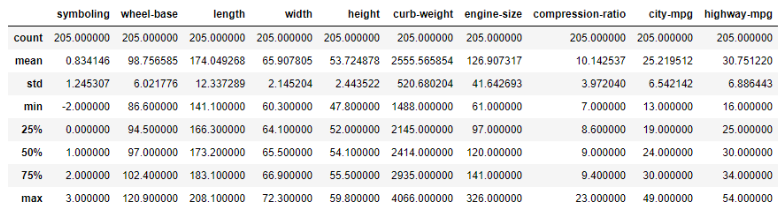
According to the count, there seems to be no missing values - however on closer inspection, the null values have been filled with a question mark (?) and therefore do not show as missing values in the count.
In a normal distribution, about 68% of the scores are within one standard deviation of the mean and about 95% of the scores are within two standard deviations of the mean. Standard deviations are quite high for Curb-weight implying the variation could be large.
The upper quartile (sometimes called Q3) is the number dividing the third and fourth quartile. The upper quartile can also be thought of as the median of the upper half of the numbers. The upper quartile is also called the 75th percentile; it splits the lowest 75% of data from the highest 25%
Minimum values - the minus value under symbolling referring to ratings, no other columns have negative values.
MISSING DATA
- Visualised Missing values:
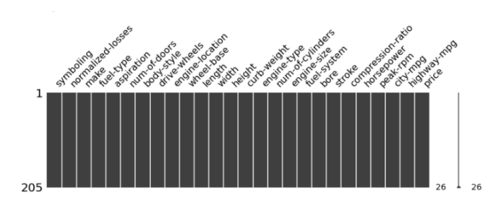
There seems to be no missing values in the visualization.
2. Actual missing values:
From investigation, the missing values have been replaced with a question mark (?) and hence do not show in the missing value counts above.
In order to solve for missing values ( ? ) with NULL value, identify the number of missing values and then apply a median or mean to fill values in.
The following columns have missing values and need to be cleaned:
- normalized-losses – 41
- price – 4
- horsepower – 2
- bore – 4
- stroke – 4
- peak-rpm – 2
- num-of-doors – 2
3. Process applied for missing data:
a) Normalized-losses:
# Cleaning the NORMALISED LOSSES field
# Find out number of records having 'NaN' value for normalized losses
# Setting the missing value to mean of normalized losses and convert the datatype to integer
b) Price:
# Find out the number of values which are not numeric using Boolean
# List out the values which are not numeric
#Setting
c) Horsepower:
# Cleaning the HORSEPOWER
# Checking the numeric and replacing with mean value and convert the datatype to integer
# Checking the outlier of horsepower
# Excluding the Outlier data for horsepower
d) Bore
# Cleaning BORE
# Find out the number of invalid values
# Replace the non-numeric value to null and convert the datatype
e) Stroke
# Cleaning the STROKE
# Replace the non-number value to null and convert the datatype
f) Peak RPM
# Cleaning the STROKE
# Convert the non-numeric data to null and convert the datatype
g) Number of doors
# Cleaning the num-of-doors data
# remove the records which are having the value '?'
DATA STORIES AND VISUALIZATIONS
1. Vehicle make frequency:

Toyota by far exceeds the other brands on the data set, almost @ 40%. Nissan is the 2nd highest. The lowest is Mercedes probably as it is a more niche vehicle.
2. Insurance risk ratings Histogram:
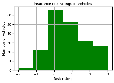
The insurance risk ratings range between -3 and 3. This dataset starts from -2 to 3. More cars fall in the range of 0 and 1 in this case.
3. Normalised losses Histogram:
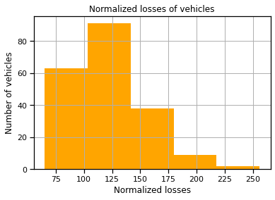
Normalized losses - average loss payment per insured vehicle year – sits mostly between the range 65 and 150.
4. Fuel type Bar chart:

The fuel type is predominantly diesel.
5. Fuel type Pie chart:
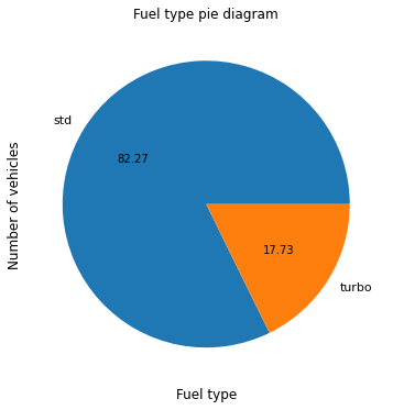
82% of the fuel type is standard versus turbo.
6. Heatmap showing correlation between features:

Price is more correlated with engine size and curb-weight of the car.
Curb-weight is mostly correlated with engine size, length, width, and wheel base - which is expected as these add up the weight of the car.
Wheel-base is highly correlated with the length and width of the car.
Symboling and normalized car are correlated more than the other fields.
7. Price and Make Box Plot:
The most expensive make is Mercedes Benz and the least expensive is Chevrolet.
The premium cars are BMW, Jaguar, Mercedes Benz, and Porsche.
Less expensive cars are Chevrolet, Dodge, Honda, Mitsubishi, Plymoth and Subaru.
The mid-range has the highest number of cars.

8. Scatter plot of price and engine size:

Engine size and price is positively correlated.
9.Scatter plot of normalized losses and symbolling:

The lower the rating, the lower the normalised loss.
10. Drive wheels and City MPG bar chart:

11. Drive wheels and Highway MPG bar chart:

12. Boxplot of Drive wheels and Price:
Rear wheel are the most expensive and then 4-wheel drives. Front wheel is the least expensive.

13. Normalized losses based on body style and no. of doors:
Two-door cars have more losses than four door cars.

For more Follow me on Medium https://medium.com/@aveshnee7
GitHub portfolio link:
 Aveshnee